
At the heart of climate policy, we have the COP26 worldwide forum coping with flawed emissions data that they cannot correct.

The Mystery of the Missing Services
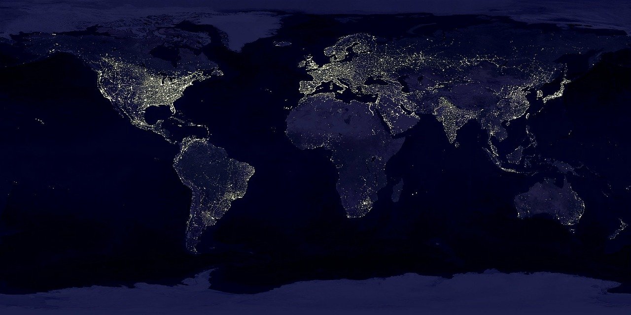
Much less visible than the goods that travel in huge container ships, the global trade in services can be seen when we just look at everyday activities.

Which Countries Want You to Have a Baby?
It is a recipe for demographic disaster when you have too many old people and not enough babies. The problem is the size of the working age population. When countries like the US are affluent enough to provide support to…

How To Cope With (Water) Stress
Being water stressed means you are unusually vulnerable to a water shortage. Sort of like a household where one emergency can push it over the edge because it spends all it earns, so too with most water stressed nations. That one drought…